CaféWell
Earning rewards is too complicated
Users can earn Amazon gift cards, Apple Watches, or even Visa Gift cards by completing activities on CaféWell. Imagine completing a 10,000-steps-a-day challenge or reading up on how to improve your sleep quality and then earning points that you don't know how to or can't redeem yet. Frustrated users stop completing any activity.
From a business perspective for CaféWell, a less incentivized population of users decreases actions taken which impacts business revenue.
A more scalable Rewards Dashboard interface where users can clearly see what progress they’ve made, understand what they have to do, and understand how their points will be redeemed to continue to incentivize them to complete actions on CaféWell.
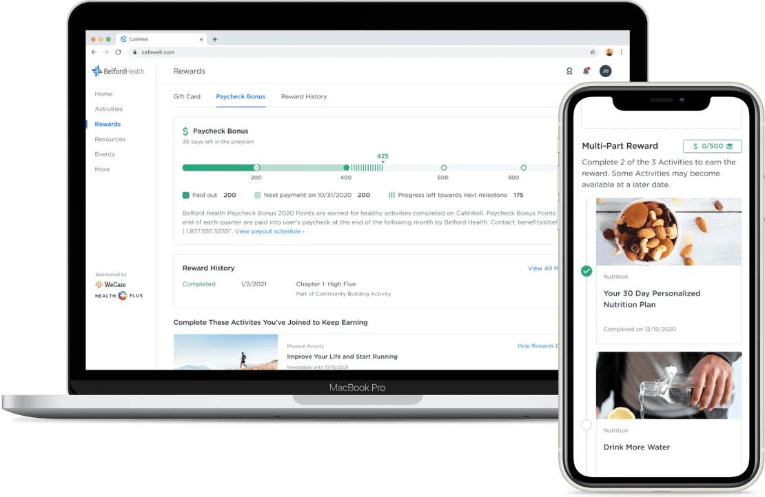
Users use the Rewards Dashboard to check their rewards status however with many configurable ways to earn and redeem rewards set up by Welltok's clients, users found the Rewards Dashboard hard to scan for the most important information.
Clients can choose to set up rewards to work in several different ways:
Rewards that can be redeemed at point
Rewards without a threshold: rewards are redeemed on a certain cadence no matter how many points users have
Rewards with a minimum threshold: users must meet a minimum number of rewards points before being automatically redeemed
Rewards with a maximum threshold: rewards are automatically redeemed on a configurable cadence
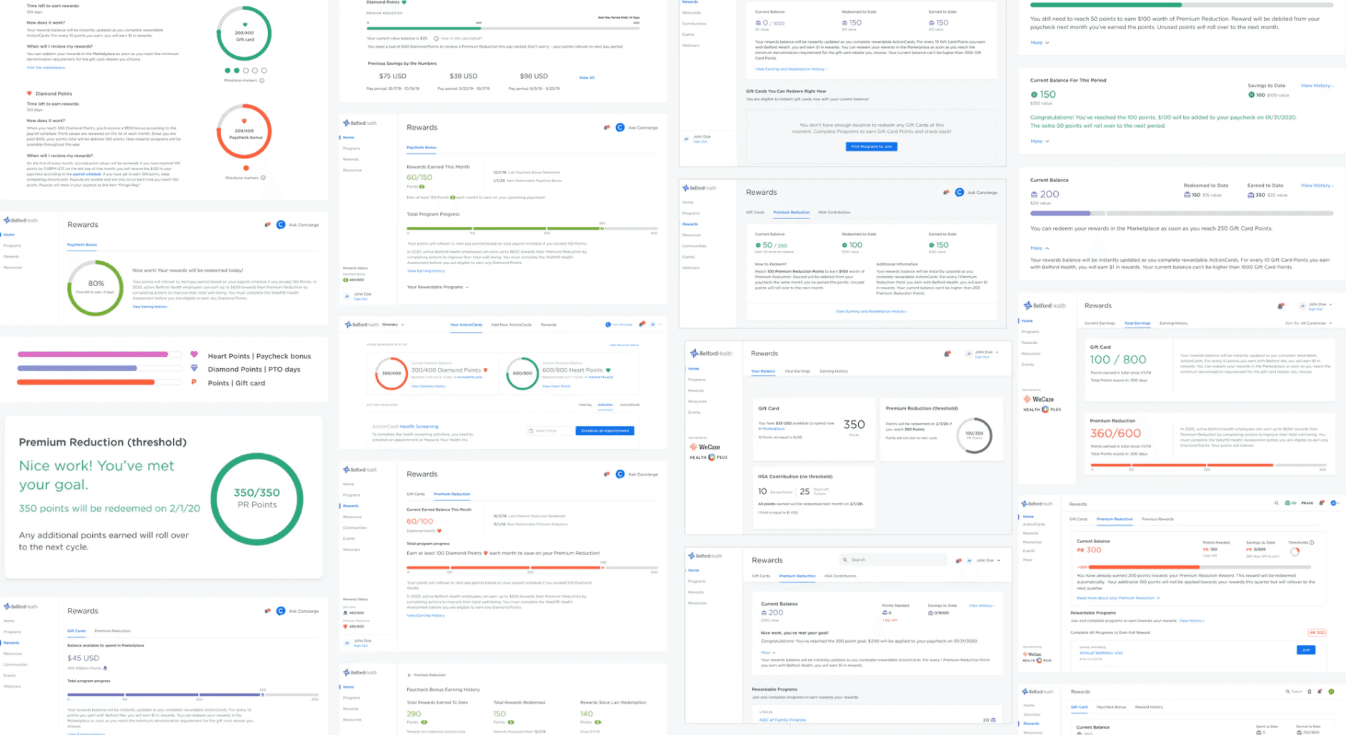
I organized the collected information based on reward type & key questions: informational, current status, progress towards overall goal and history.

With two main types of ways to earn:
With thresholds (time based increments that reward points are automatically redeemed set by a client)
Without thresholds (user can manually redeem at any time)
I explored ways to visually differentiate the progress bar in the UI to help users understand the differences in the redemption process, especially for rewards with thresholds grounded in user feedback.
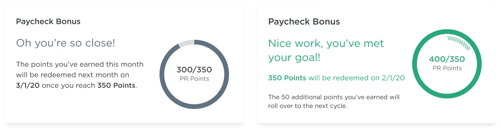
Threshold reward cycles caused confusion for users when rewards were automatically redeemed without being notified. This would lead to users seeing a current balance of (total) points that wasn't reflected in the progress bar since they had moved onto a new rewards cycle.
I explored the progress bar resetting every time a threshold has been debited:

Showing the users a progress bar that has reset back to zero would give a visual indicator that a user's points have been redeemed and help explain a discrepancy between the current balance and the total balance.
However, the login frequency of many CaféWell users is less than 1x / week, and having the user's progress bar set back to zero while the user is offline could be equally confusing as not seeing any further details.
Additionally, the post-reward phenomenon indicates that motivation tends to drop to the baseline after their goal has been reached, even with another reward potential opportunity. This risks consumer drop-off in both their rewards & healthy behavior activity.
In some cases, rewards that were automatically redeemed would not be automatically applied. Certain rewards like a paycheck bonus would be automatically redeemed on the threshold reward schedule but don't actually apply to user's paycheck until a different pay day. This asyncronized schedule confused and frustrated users as their points were automatically redeemed without being able to be used.
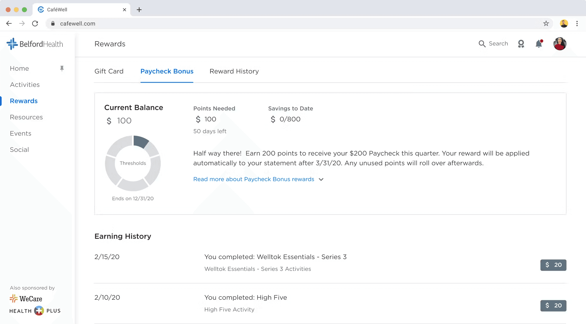
I explored displaying both the current progress and balance while keeping the context of the full year's earning potential.
Since users could have more than one reward available to earn and with so many complex states for each, it was crucial to explore a scalable rewards dashboard that could accommodate any rewards scenario.
I explored displaying a more scalable dashboard to display the various states that a user's reward could be in.

It was important to be able to show user's progress in the context of the whole year but with incremental thresholds and a user's current balance not always the same value as their total progress throughout the year, I found it difficult to display both a micro and macro scale on one progress bar.
For reward types with thresholds, I iterated from the donut progress bar to indicate at a glance that this reward type worked differently than rewards without thresholds. Each segment indicated a threshold that a user must meet in order to redeem their rewards. Users could quickly scan their current balance and how many more points they need to meet their next threshold.
I opted to test this design using in-person usability testing sessions scheduled with both users and stakeholders of the platform and using Maze.design prototypes. I also presented my designs to several current clients to gather feedback on if the designs would solve concerns they had heard from their own users of the Rewards Dashboard.
👍 Here's what was working:
Seeing the current balance is clear and did not conflict with any numerical value on the progress bar to avoid causing additional confusion
Users can visualize their progress in relation to the whole program year if there are multiple rewards available
🖐 Here's where we needed continued iteration:
If users had more than one reward type, seeing two completely different UI progress indicators could be confusing
Dynamically presenting relevant copy to the user at every point throughout their rewards experience would be a large UX-writing and development lift that would fall out of scope
States for current balance, pending rewards & previously redeemed rewards were still left unclear
Design pivot: to address feedback, I explored a way to use one UI progress indicator to scale to all currencies, states, and complex scenarios without relying on dynamic UX writing or catering to edge use cases that would be phased out over time.
I worked on a UI pattern for each of the 3 main rewards states to use on the progress bar. These 3 states scale to all reward types including gift cards, paycheck bonus, premium reduction, HSA/FSA, paid time off, or sweepstakes entries.

Using these 3 states to depict previous, current and future state for all Rewards scaled to over 8 common reward configurations.
At the end of this project, we saw an increase in number of Activities completed due to clearer incentive to earn, we saw an increase in Consumer NPS feedback and score in the first 3 months after release, as well as a 10% decrease in support tickets regarding rewards.
This work also lead to:
A new library of currency icons to accurately depict each currency type
Transactional rewards history page that includes earned, spent, and pending rewards
A Rewards Dashboard that can scale to include multiple family members
A redesign of the entire Marketplace user experience
A UI & UX refresh of Activity complex business rules that allow users to earn rewards