Welltok
There is not a cohesive design experience for users and designers spend time rebuilding similar components
With 7 acquisitions by Welltok between 2010 and 2018 clients using Welltok's products don't have a cohesive design experience. Additionally, there were few core components built for reuse for either designers or developers to rely on as a source of truth, losing both time and consistency.
A scalable design system of components with documentation that can create a cohesive design experience for internal and external users as well as streamline development work.
As both projects evolved, I was able to expand on components beyond immediate use and relied heavily on our design system documentation for communication with developers so I could streamline both time and Figma design files.
The challenge throughout the early stages of the project and design system were to ramp up quickly to define & standardize a working design system for both designers and developers to refer to maintain consistency and increase efficiency.
Design assets when I began at Welltok
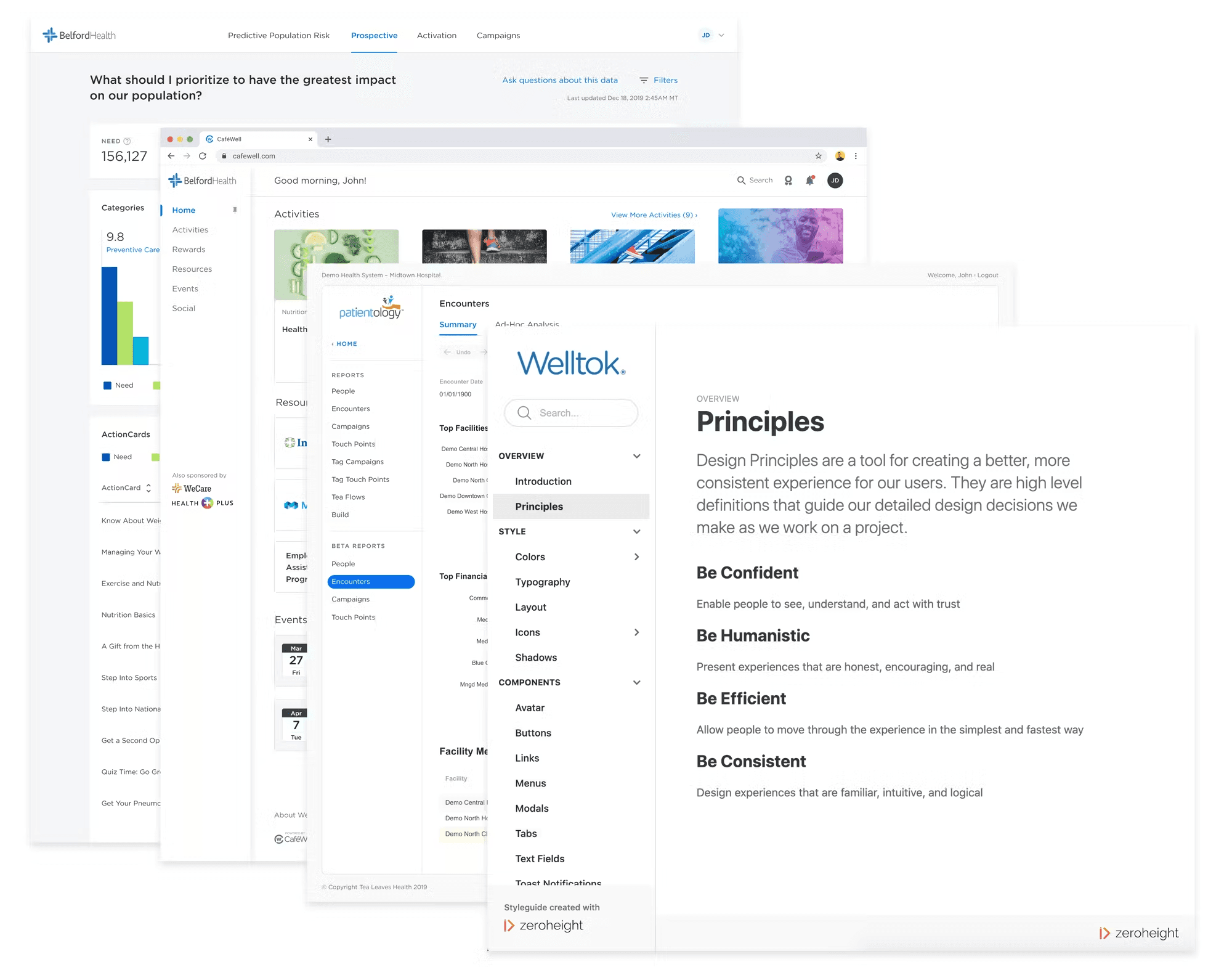
The definition and documentation of the design system were still relatively exploratory at the beginning of this project but as a redesign of the entire consumer-facing product CaféWell was prioritized, as the senior designer, I pioneered all-new styles, components, and patterns for the updated user experience by evolving our design system, Elevate.

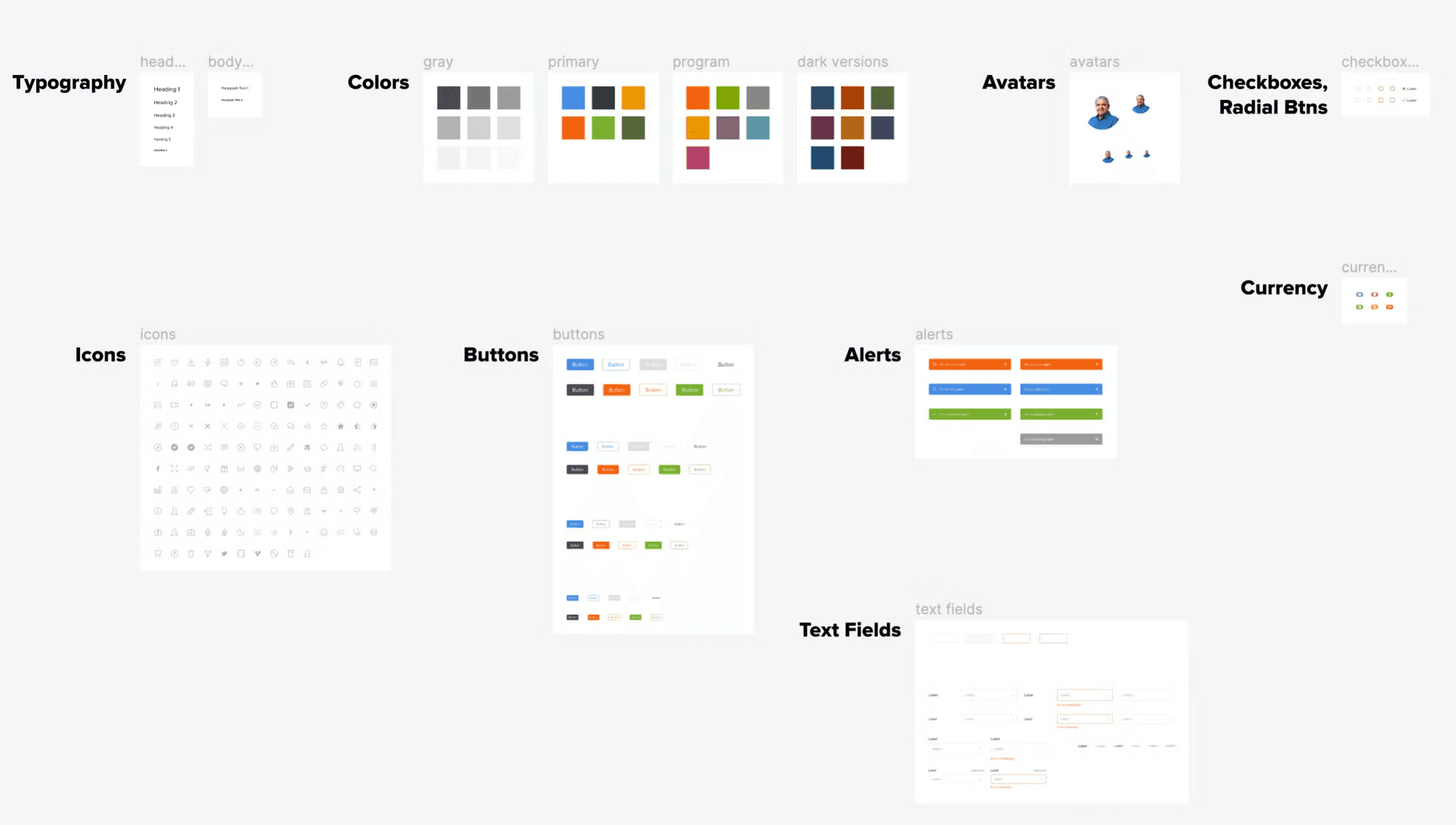
Early organization and prioritization of Welltok's first design components
When building out new components & patterns there were several things that were considered for each new addition to the library:
Accessibility
Scalability & flexibility
Functional
High visual quality
Mobile responsive (to both web & native iOS & Android)
As the component library on Figma grew, design efficiency increased, I was able to focus on higher level UX design flows instead of recreating components across pages or responsive sizes.
Creating clearly labeled Figma files to organize all components in a shared & public space on Figma helped teams grow familiar with existing components, their build status, and leave feedback.
I also began to document the guidelines and uses of the elements in Zeroheight, an online document accessible by anyone in the company. This document served as an invaluable resource for myself and the developers as we collaborated to build these components out on CaféWell as they were able to inspect spacing, size, color, accessibility considerations as well as expected behavior.
I worked closely with developers to build out many functional components that appeared in CaféWell’s redesigned UI & UX experience and beyond. We continued to collaborate on additional HTML/CSS/JS components for all variants so that they could be documented on Zeroheight to ensure continued proper adoption beyond the Product Team.
I also generated a backlog of prioritized components and patterns to build out in Figma and document on Zeroheight based on upcoming needs in future iterations.
This design system was a continued & ongoing project and many of the components were adopted by other designers on the team in other Welltok products.