CaféWell
Tracking physical activity takes too many steps
With a multi-step process to manually log physical activity and an unclear user experience to connect and use wearables, user’s frustration impacted the overall number of entries logged on the platform costing users healthy activity as well as revenue from a business perspective for CaféWell.
A more streamlined process of logging physical activity at any time, seeing connected devices and data to improve morale and encourage additional logged entries.
Users log activity in three main ways:
by duration over a time frame (ie. log for 5 days)
by attestation (ie. logged on a given day or not)
Or by metric (ie. log 10,000 steps).
Users can connect and use their wearable devices like an Apple Watch or Fitbit on certain eligible programs but with multiple types of trackers possible in a user's account, it was unclear where or when users could streamline their experience by using a wearable.
To increase healthy habits forming, many programs that included activity tracking poritons spanned over several weeks split up into activity groups called "chapters", "parts" or "weeks" that had configurable time periods set by the client. But, these activity groups were not called out on the UI so when users were tracking, many users were accidentally in the wrong activity group and losing out on potential rewards that were available per activity group.

The following explorations explore solutions in a new UI style which was part of the overall UI/UX design refresh of the consumer experience on CaféWell I led.
Can we leverage a "get-in-and-get-out" experience for users to quickly log their activity straight from the home page without having to click through so much?

Ultimately, the complexity of logging activity from a previous day and the lack of context for users to understand where their data was being sent, I felt that logging needed to provide greater context than one small widget could.

Instead of logging in a small widget, allowing users to log directly onto their activity graph gave users more context around the type & date of their entries and decrease the number of clicks to log on their desired date.
This exploration maintained visually differentiating between manually logged data and data collected from a wearable but this brought up a key question that would impact further explorations.
57.2% of users said that they would not seek to decipher the differences between device and manually logged data at a glance but would still expect to find it in their history.
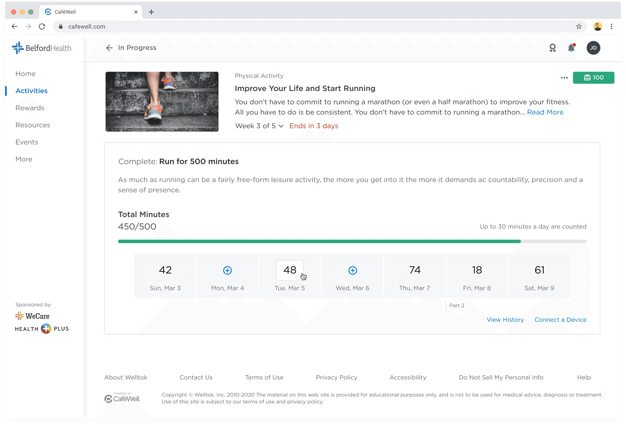
Logging directly on the Activity Tracker calendar would allow users to quickly log on to any date, even in the past.
Instead of working within a modal, user's could clearly and quickly see their goals, progress, and context of the program on the full page. However, with such a streamlined logging experience, inline editing provided little room for users to edit or modify any data.
I tested the in-line editing iteration with several in-person usability testing sessions scheduled with both users and stakeholders of the platform and using a Maze.design prototype.
Users appreciated:
Eliminating a modal logging experience and providing an in-line editing experience leveraging the full page improved orienting users to the context of their program (date, progress, activity group, etc)
Users felt confident in the total amount of activity logged for each date
Here's where we needed continued iteration :
Confusing UX to add additional data - would you add in the new total amount? Or type in the new amount using a math equation of "+" or "-" the changed data?
Feedback from stakeholders was also considered:
Technical limitation: only manually logged data can be edited. In the presented designs, there was no way to easily edit just manually logged data since there is no differentiator or history exposed
Any dates with any device data would be rendered "Read-only" without further iterations
Being able to see what data was collected by a device vs. manually logged was extremely important to stakeholders and was a missed opportunity in designs presented
After continued iteration and continued work with the Product Team, I revised my designs to address key concerns and ensure user's needs were being met. To address the feedback, I made several updates:
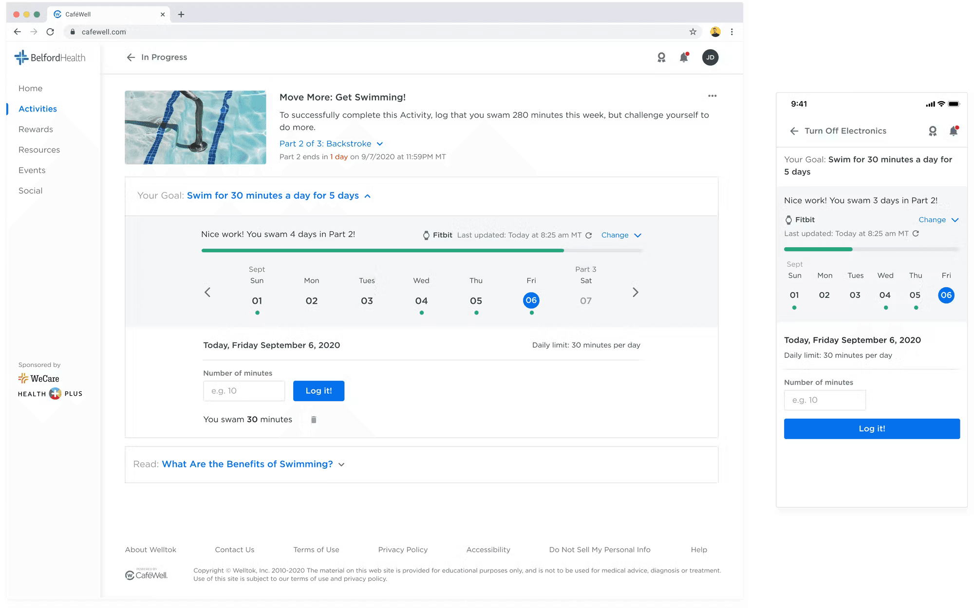
Added a dynamic sentence to ensure users were clear about their goal for each activity group (ie. "You swam 4 days in part 2!")
Included a way for users to visually see the state of their wearables (if applicable) and a way to manually force refresh to update their latest data
Included space for a user to see the historical data of each day without clicking onto a separate page
Added green dots indicate on each day of the week whether data was logged and can provide users at a glance information on which days they may need to update or log on
At the end of this project, we saw an increase in number of activities logged completed, an 20% increase devices connected in first months after launch, as well as a decrease in support tickets regarding how to connect a device to an activity.
This work also lead to:
Integrated challenges, leaderboards and discussion posts with Activity Tracking
Syncing Apple Health data to each tracker on our mobile native application